What it does
The alerts board is the whole network's service status in one place: a line-status grid at the top, then every live disruption grouped by agency, then by mode, then by what kind of problem it is.
It is not a separate app you check before planning. A disruption on a line pushes every route that touches it to the bottom of your results and puts the reason on the card, so the routes you are shown have already taken the bad news into account.
On top of what is happening now, Reroute carries what usually happens: a model trained on 393,303 real TTC delay records, flagging a line as riskier than typical before you commit to it.
How it works
Live alerts are pulled from each agency's own feeds and normalised into one vocabulary, so a closure reads the same whether it started on a subway line or a commuter rail corridor. Anything outside its active window is dropped, which is why a cleared alert reads as gone rather than lingering as a stale notice.
Each alert is classified into a category and a severity, and that one classification drives everything downstream: the colour of the dot on the line board, the order the groups appear in, whether the shell shows a warning dot at all, and the wording of the disruption note on an affected route.
Where an alert names a stretch of line, Reroute works out which stations it covers and draws it on the map, and marks any route whose legs cross it. That is the difference between telling you there is a closure and telling you your trip runs through it.
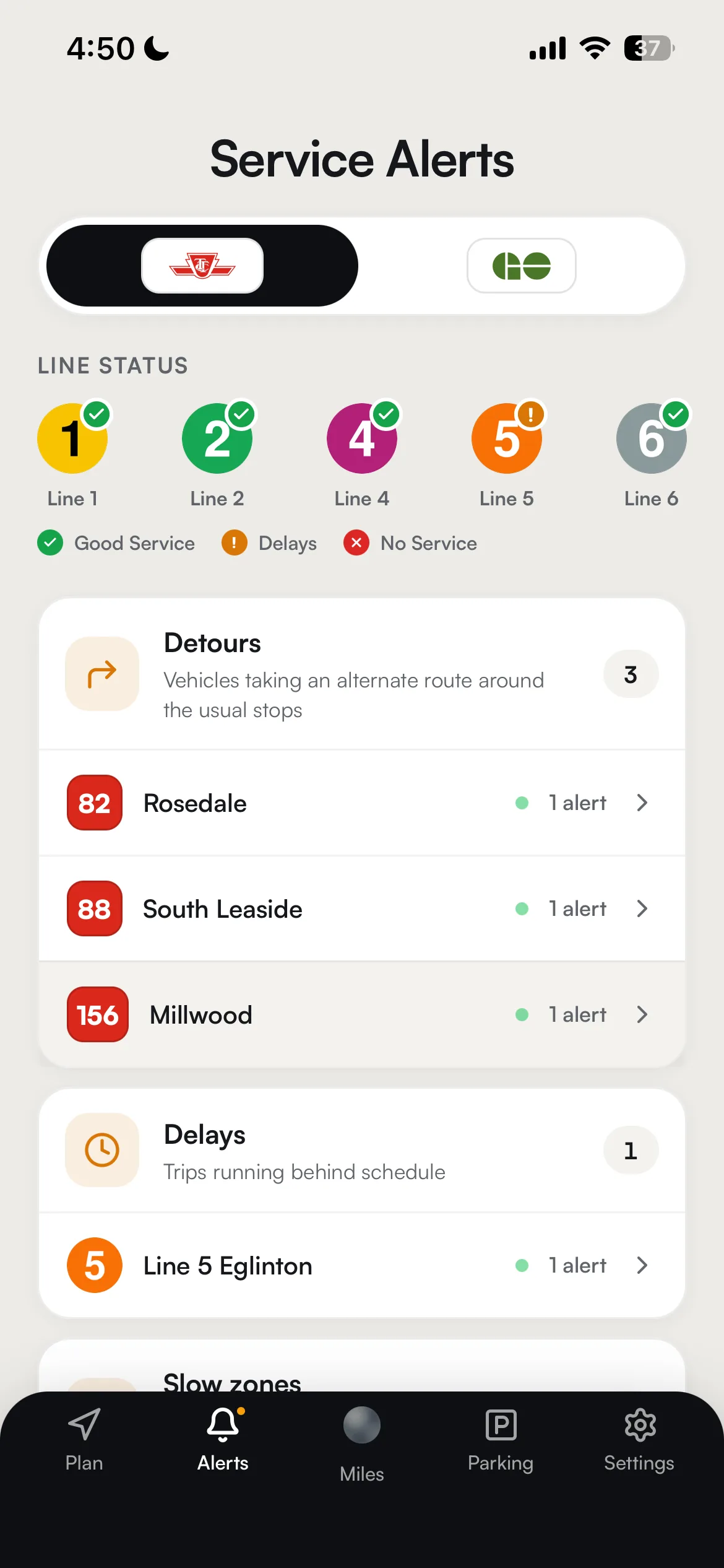


Three states, and only three
The line board has exactly three colours. A status ladder you can read at a glance from a moving streetcar is worth more than one that is precise, so the finer detail a feed carries is a word in the panel and never a fourth colour.
- Good Service
Nothing active on the line that a rider would feel as a delay. This is the default, and a line has to earn its way out of it.
- Delays
Something is slowing the line down: trips running behind, or a detour around the usual stops. Routes through it stay in your results, with the reason attached.
- No Service
Part of the line is not running. Every route that crosses the closed stretch drops to the bottom of your results, and the stretch itself is drawn on the map.
What deliberately does not change a line's colour: elevator and escalator outages, planned service changes, and reduced-speed orders. All three are real, all three are shown in the panel and on the map, and none of them is a reason to tell you a working line is in trouble.
Make it yours
Every setting below is named exactly as the app names it, with where to find it. None of it needs an account.
- Service alertsSettings → Map → Live data
- Draws shutdowns and slow zones on the map itself, as spans on the affected line rather than as pins. Turn it off if you want a clean basemap; the alerts screen and the route warnings are unaffected.
- Traffic congestionSettings → Map → Live data
- Colours drive routes by live traffic. It is the road half of the same question the line board answers for transit.
- Subway, GO, UP Express, StreetcarsSettings → Map
- The overlay cards at the top of the Map section, each of which can be turned on line by line. Narrowing them to the lines you actually ride makes a drawn disruption on one of them much easier to spot.
- Transit agenciesSettings → Trip preferences
- Shapes what gets routed, not what gets reported. The alerts board deliberately keeps showing every agency, because a rider who turned an agency off for routing still wants to know its line is closed.
- Sort routes bySettings → Trip preferences
- Whatever you choose, a route touching a disruption still sinks to the bottom and a route running genuinely late right now still sinks below a comparable on-time one. Sorting reorders the rest.
Get more out of it
- Read the line board before the notices
It is the fastest answer in the app. Problem lines are pulled to the top and the healthy ones collapse behind a count, so a glance tells you whether the rest of the screen is worth reading at all.
- Tap a degraded line for the reason
A red or amber tile opens into a plain-language explanation and a link to that line's track record, which is where "is this normal for this line" gets answered.
- Trust the dot in the app shell
It lights only for genuine trip-affecting disruptions. Elevator outages, slow orders and planned service changes deliberately do not fire it, so the dot never trains you to ignore it.
- Let a delayed route sink
You do not have to filter anything. A route running late right now is already ranked below a comparable on-time one, and one crossing a closure is already last, so the top of the list is the honest answer.
- Use the Union board for commuter rail
The GO section opens a live departure board for Union with platforms and cancellations, which is the one thing a general alerts feed will never tell you in time.
Good to know
- A slow order is not a bad day
Reduced-speed zones are classified as advisories, so a line under a slow order still reads as good service. It is a real effect on your journey time and it is shown on the route, but it is not the same event as a closure.
- When a feed is down, nothing is drawn
If the alerts feed is unavailable the app shows a degraded banner rather than an empty board, and closures are deliberately withheld from the map rather than drawn from stale data. An imaginary closure is worse than no closure.
- Commuter rail status has two sources
The corridor status board prefers the operator's own public status feed. If that is unreachable, the app falls back to reading the alert text itself, which is a fair summary rather than an authoritative one.
- The delay model is a heads-up, not a forecast
It is trained on a log of delay incidents, so what it can tell you is how often a line runs into trouble relative to a typical trip and how severe that trouble tends to be. It is not the chance that your trip today is delayed, and Reroute will never present it as one.
- Some lines have no history worth using
Newer lines and decommissioned ones do not have enough logged incidents to say anything honest, so they fall back to a neutral baseline. An under-covered line is never made to look artificially safe.
Under the hood
Alerts come from each operator's live feeds, TTC's own alerts service first with the standard GTFS-realtime feed behind it, and Metrolinx's service updates for GO Transit and UP Express. They are merged rather than substituted, so an outage on one operator's feed cannot hide another operator's live alert, and a fallback response is flagged as degraded rather than served as data.
The line board's three states are derived by folding every active alert onto its line and keeping the worst severity, with route identifiers normalised carefully enough that a bus route whose number happens to contain a line number cannot mark that line down.
The delay model is a gradient-boosted classifier trained on 393,303 TTC delay records covering 2022 to 2025, with weather joined in. It is deliberately exposed as a relative risk index, incidents per scheduled trip rather than a probability, because the training data contains no on-time trips and therefore cannot support a probability. Severity is reported from empirical medians and percentiles instead of the model. If the model is unavailable a rule-based predictor takes over and the app carries on.
Live vehicle positions and realtime feeds refresh on a fifteen second cycle. For lines whose operator publishes realtime in a form the routing engine cannot ingest directly, Reroute bridges it: subway predictions are matched to scheduled trips and republished, and surface vehicles are map-matched from their GPS onto the route shape, with confident matches only.