Features

Every way across the GTA, and the intelligence behind it

Four modes, one ranked list

Transit, driving, walking, and park-and-ride for a single trip, compared side by side.

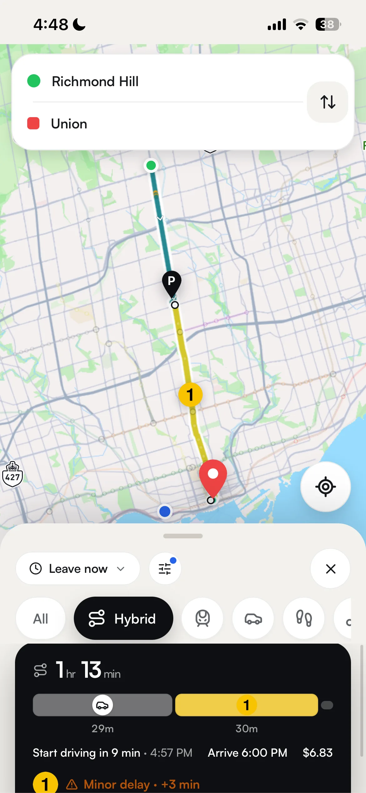
One trip request fires the MOTIS transit search, the Mapbox Directions drive and walk lookups, and the park-and-ride legs all at the same time, then labels, sorts, and returns a single ranked list with full map geometry and real cost.

Best, not just fastest

Ranks on Google-Maps-style perceived cost, so a one-seat ride can beat a transfer-heavy patchwork.

The default Best ranking scores total time from now, adds 5 minutes for every transfer, and weights walking minutes at 1.75x, so a simpler ride can win. Routes running behind sink to the bottom on live GTFS-RT delay data only, never on the conditional delay-severity model.

Park & ride, both directions

Drive-to-a-station-then-transit and transit-then-drive options, built for both handoffs.

Reroute scores nearby rapid-transit and GO stations using real parking data, then stitches a Mapbox drive leg onto a MOTIS transit leg (or reverses the order for transit-first trips) and flags one recommended station.

Reroute fingerprints each trip by its lines and its boarding and alighting stops, drops phantom or trivial one-stop hops, merges near-identical feeder variants, and caps the result at six distinct options.

When live GTFS-RT data shows your route running behind, Reroute surfaces on-time alternatives within six minutes of the delayed trip's total time, each tagged with how much time it saves.

Reroute pulls Mapbox live-traffic driving data with congestion detail and splits the path into segments shaded by severity. Where Mapbox has no coverage it labels the stretch 'Unknown Traffic' rather than faking a clear road.

Turning on avoid-highways or avoid-tolls asks Mapbox for alternate drives that skip motorways or toll roads. Each option is badged fastest, shortest, or scenic, and if the fastest breaks your rule, a matching alternative is promoted to the top.

Mapbox's walking directions return the route, which Reroute skips entirely beyond a 5 km straight-line distance. Its comfort score rises in adverse Open-Meteo weather, so a rainy walk honestly reads as more taxing.

Your filters drop non-matching trips after the MOTIS search. If nothing survives, Reroute re-runs with defaults and labels the restored routes 'shown by relaxing your filters', unless you have set a hard restriction it must respect.

The leave-time control switches between leave now, depart at a set time, or arrive by a deadline. Changing it re-plans the trip, and MOTIS honors a strict arrive-by deadline so you land on time rather than just setting off then.

On leave-now trips, Reroute slides your first leg to an earlier departure on the same line, sized to how often the onward line runs (about 1.5 minutes for a frequent subway, up to 12). Your arrival stays the same because you still catch the same onward vehicle, now with a real cushion at the transfer.

Dragging the origin or destination marker reads the new coordinates and re-plans the trip immediately. It is disabled while you are navigating, so it can never disrupt a route already in progress.

When you name a stop like Union Station, Reroute matches it to the exact MOTIS stop and boards you there directly, with no awkward walk-in leg. If the name cannot be matched, it falls back to the map location.

To build a custom route, Reroute reads the GTFS schedule to find lines serving both ends plus the TTC interchanges that connect them. For a multi-stop trip, it computes an efficient visiting order so you cover every stop with the least backtracking.

Every GTA agency, one call

Directions across TTC, GO, YRT, MiWay, UP Express, and 30+ more GTA agencies at once.

A self-hosted MOTIS engine plans every trip in about a second, returning ranked options across all modes with each leg's stops, line badges, and map geometry. It is our only transit engine, and it automatically widens the search when a first pass comes up empty and fails over cleanly, so one slow request never stalls the app.

Live times on every leg

Departure and arrival countdowns reflect the vehicle's real position, not just the printed schedule.

Reroute overlays TTC NTAS, NextBus, and GTFS-RT feeds onto each leg, marking a live source and delay only when a feed genuinely matches the trip. Times fall back to the published schedule when no live feed confirms them, and stale or placeholder data is never shown as live.

Will you make the transfer

Each connection shows comfortable, tight, or risky with a live buffer and make-it odds.

Reroute reads MOTIS's realtime-adjusted arrival and departure times on either side of a connection and works out your live buffer plus the odds of catching it. Because MOTIS planned the transfer in the first place, the two legs are known to connect, with no guesswork matching stop names.

Reroute pulls predictions from the NextBus / Umo IQ feed, matched to the GTFS schedule and cached for 15 seconds per stop. When a live prediction exists it overrides the timetable, hiding cancelled or already-departed ghost trips.

Reroute loads each agency's GTFS feed into one merged store at startup with agency-prefixed IDs, isolating any failure so one bad feed never takes transit down. It resolves which services actually run today in Toronto time, so future-dated GO schedules never leak into departures.

Reroute checks TTC's NTAS service every 30 seconds per platform, filling the gap left because TTC leaves subway and LRT out of its GTFS-RT feed. Quiet or out-of-service platforms drop off after repeated misses and are re-checked hourly, so we never hammer TTC's systems.

A GTFS-RT poller publishes one complete snapshot per cycle and swaps it in all at once, so you never see a torn mix of old positions carrying new flags. Anything older than 90 seconds is marked stale rather than served as live, and placeholder data stays clearly labeled.

MOTIS takes the Metrolinx and York Region live feeds in per agency, so those legs are delay-adjusted inside routing itself, not just relabeled afterward. Reroute lets MOTIS lead and only fills gaps it leaves, so a delay is never counted twice.

Reroute matches TTC NTAS predictions to scheduled trips and snaps live vehicle GPS onto route shapes (disambiguated by heading and gated on confidence), then feeds both to MOTIS as synthetic GTFS-RT so routing accounts for real lateness. Vehicles that are ambiguous or off-route stay put rather than guess.

Reroute builds a cached, searchable index over the GTFS schedule, ranks your matches, and works out branches and directions from each trip's headsign. Every stop lists its next few departures, marked live or scheduled with a delay when the feed disagrees.

Reroute pulls today's in-service departures and overlays the agency's live updates trip by trip, collapsing duplicate clock-times and counting down correctly across midnight. Entries stay marked scheduled when no live feed confirms them.

Reroute turns Metrolinx's Union departures and service-exceptions feeds into a live board, reading each train's platform to tell boarding apart from merely scheduled. When no Metrolinx key is configured it shows an empty board marked not live rather than guessing.

Reroute identifies each GO train by its line and trip number, then matches it against Metrolinx to read the scheduled and actual boarding track. Non-rail or unmatched trips show no platform rather than a made-up one.

Delay risk from real TTC history

Every TTC transit leg gets a data-driven read on how bad delays tend to be.

A calibrated XGBoost classifier and regressor, trained on 393,000+ real TTC delay records since 2022 and enriched with Open-Meteo weather, score each leg by hour, day, line, and live conditions. The result is a conditional severity (how severe a delay tends to be when an incident happens), never an unconditional percent chance your trip is late.

How likely vs a typical trip

An honest 0 to 1 index of how often a line logs disruptions, per service run.

It divides logged incidents by the number of scheduled trips, then applies statistical smoothing and calibration so a busy trunk line is not penalized for simply running more service. The result is a relative-risk-versus-typical index sorted into qualitative bands, never presented as a literal percent chance.

Line reliability track record

See a line's real delay pattern by time of day and weekday versus weekend.

It reads the historical severity tables into a grid of five time-of-day buckets by day type, each cell pairing typical delay minutes (median and 90th percentile) with a relative-risk band. Lines with no line-specific data show an empty state instead of a system average.

Each route blends transfer count, predicted delay severity, live traffic, and adverse weather into one comparable number (driving adds congestion, or a rush-hour proxy when live data is missing). The delay term is display-only and never affects ranking, keeping delay from ever being presented as a probability.

The badge escalates only for real, nameable reasons: slow zones, surface traffic, service alerts, closures, or bunching. Pure context like rush hour, weather, or a weekend can never raise it on its own.

Each flagged leg lists structured factors (rush hour, weather, weekend, limited data, active alert), each with an icon and an info, warning, or alert severity. A 'Limited line data' chip honestly signals when an estimate rests on a broad baseline rather than line-specific history.

It measures the buffer between arriving and departing (live GTFS-RT times when the vehicles are tracked, otherwise scheduled), then runs a statistical model over the inbound line's real delay spread to estimate the make-it odds. This transfer signal is kept separate from delay risk so the two are never conflated.

It reads map-matched GPS vehicles grouped by route and direction, flagging gaps that fall below 40 percent of that lane's own median spacing (severe below 15 percent). It is a reliability flag only, never changing an ETA, and needs at least three vehicles to avoid false positives on busy lanes.

When an active GTFS-RT warning or error alert matches the line you asked about, it raises the risk to a minimum severity, lifts expected minutes to the 90th percentile, and shows that alert first. Mock feeds, info-level notices, and system-wide placeholders never trigger it.

The tables are built from the 2022 to 2026 TTC delay log; a lookup starts from a specific line, time, and day, then widens to coarser groupings if needed and reports how specific the match was, so the app always knows how line-specific each answer really is.

Lines with no service history or no logged incidents fall back to a neutral baseline instead of a misleadingly low number, and the risk index skips them rather than passing off a system average as that line's own record. This is what stops uncovered lines from silently inheriting Line 1's pattern.

The model trains on earlier dates and is evaluated only on later ones, so it is always tested on data it has never seen, and any features that would have let it peek at the answer were removed (they had inflated an old 98 percent accuracy headline). It reports honest calibration and error measures rather than a single accuracy figure.

Ask in plain English

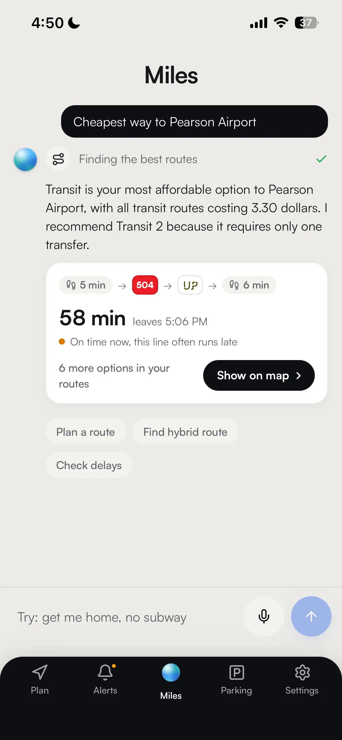
Type a natural-language transit question and get a concise, grounded answer in seconds

Your question goes to Google Gemini, which works through up to five rounds of tool calls, drawing on any of seven live-data tools before it answers.

See it think, then see the route

Live thinking chips show each tool call while the picked route lands on the map

As the assistant streams its reply, the app shows labeled thinking chips like 'Finding the best routes' and draws the chosen route straight onto the map.

Never bluffs about service status

It refuses to claim a line is open, closed, or delayed without checking live data

It is instructed never to state service status from memory: it must pull live alerts or station departures that same turn, or point you to ttc.ca or gotransit.com, and it never recommends a line with an active closure.

When a Google Gemini key hits its quota, it is benched for a cooldown window (15 minutes by default) and the request retries on the next key; a health check reports how many keys are configured versus available without exposing any key.

Chat trips run through the same routing engine as the map (MOTIS for transit plus Mapbox for driving), so the options match your route cards and can be drawn on the map as they stream in.

The delay check returns a relative risk index (how a line compares to a typical trip) plus a conditional severity read (how bad delays tend to be when an incident actually happens). It never states an 'X% chance', and lines it doesn't cover are honestly declined rather than guessed.

It reads live GTFS-RT service alerts and pulls the next departures from the GTFS schedule active for that day, so late-night and weekend advice reflects the real timetable rather than memory.

It lists nearby TTC and GO stations with real parking details, then weighs live alerts, rush hour, reduced weekend GO service, and traffic against Toronto local time to pick the best drive-then-ride plan.

The modes you rule out are passed straight to the routing engine, which filters them out and turns off the fallback that would otherwise relax your constraints, so an excluded mode can never be quietly added back.

It pulls current conditions from the Open-Meteo weather service, falling back to default Toronto winter conditions if that service is unavailable.

It reads keywords in your message (delay, hybrid, route, weather, commute) and returns a curated set of up to three follow-ups, delivered with the answer and as it streams.

Outside text is wrapped and escaped so it always reads as data, conversation roles can't be forged into trusted turns, and raw error text is never echoed back, which blocks prompt injection through third-party content.

The browser's Web Speech API turns dictation into text in the search box, and a global shortcut opens and focuses the assistant on Cmd/Ctrl+K and closes it on Escape.

Only disruptions on your route

Filters every alert and slow zone down to the exact stretch you actually ride.

It goes past a rough line match and checks the geometry, keeping a disruption only when it runs within 250 m of one of your transit legs. It measures against both the detailed MOTIS route line and a stop-by-stop path, so a slow zone on a branch you never touch stays hidden.

Every disruption, two taps deep

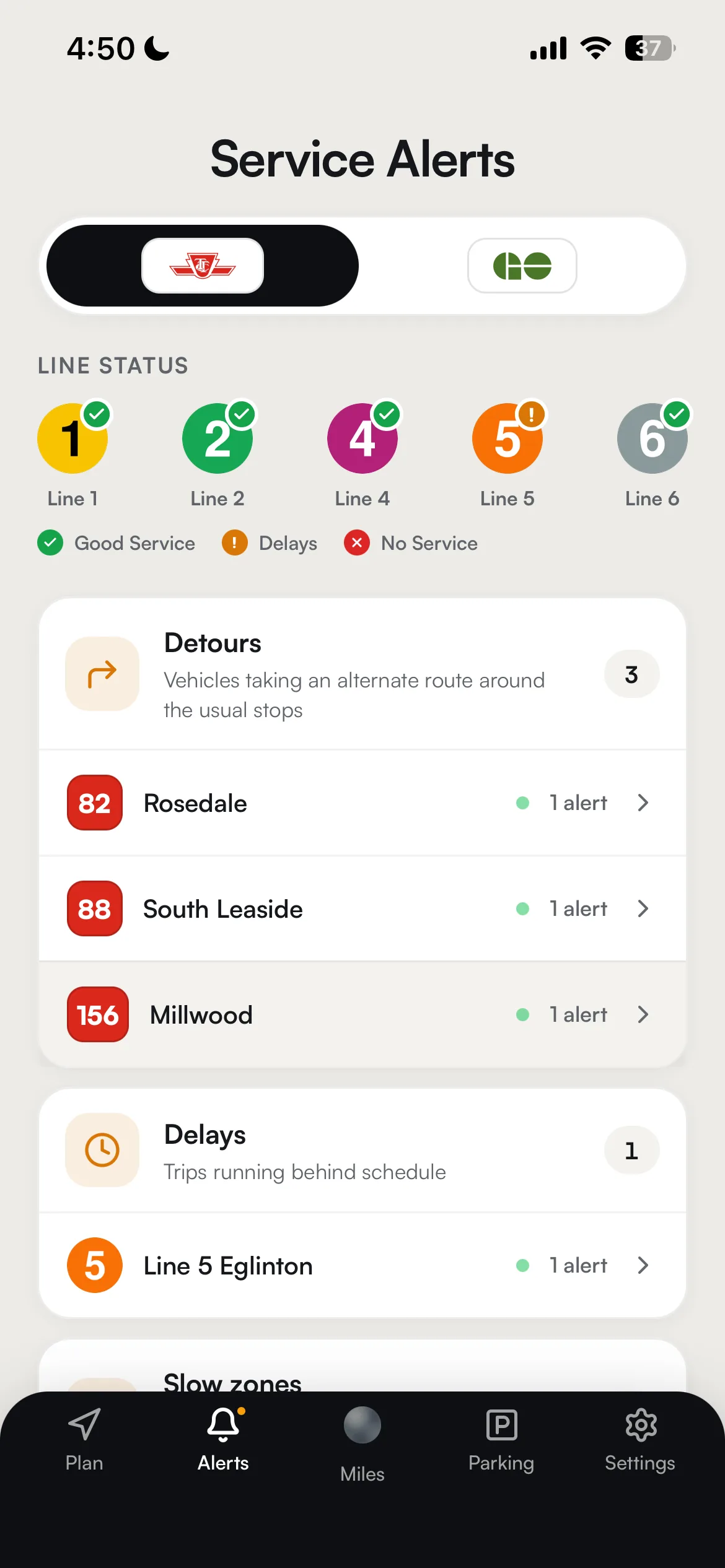
Drill from agency to mode to event type, most severe first, without a wall of notices.

Active alerts are grouped by mode and then by event type, with the worst-affected groups sorted to the top and TTC line roundels shown. The list refreshes every 30 seconds and announces count changes aloud for screen readers as service recovers.

Subway-map health check

Each rapid-transit line shows Good Service, Delays, or No Service at a glance.

Active alerts are folded into a single worst-case status for each line, and bus or streetcar routes that merely share a digit with a subway line (like the 504 streetcar) are correctly excluded. Line 3 is left out because it is decommissioned, never guessed at.

Reroute reads the TTC's public Reduced Speed Zones page every 15 minutes and turns each per-line table into a slow-zone record. The extra time is estimated from the zone's length and speed drop, capped at 1 to 3 minutes.

A background service reads TTC's live alerts feed as the primary source and falls back to the GTFS-RT feed, sorting each notice into a clear category. The cached list is tagged so the app can tell real, mock, and stale data apart.

Alerts outside their active time window are filtered out, including a correct read of TTC's open-ended entries that carry no end date, so the list shows only what is disrupting service right now instead of lingering stale placeholders.

Metrolinx service updates for GO and UP Express are mapped into Reroute's standard alert shape, reusing the exact same category vocabulary and severity scale as the TTC path, so a GO alert renders identically to a TTC one.

Each alert category maps to a plain color and label, and a leg's status is raised only for concrete causes like closures or major delays. Context like rush hour, weather, or a weekend never turns the badge red on its own.

Reroute compares each refresh against the last to spot wording that signals recovery (resumed, restored, reopened) and keeps just-cleared alerts around for a short window, so the app can show an explicit Ongoing or Resolved state.

A slow zone counts only when both its endpoints fall on your leg's station path in the direction you travel. Those minutes are added to total travel time only, deliberately never double-counted into the delay badge.

It applies to buses and street-running streetcars (but not dedicated right-of-way lines like the 509, 510, and 512, or grade-separated LRT), comparing live versus free-flow Mapbox driving times over the leg and emitting a capped Heavy traffic factor.

Reroute pulls the City of Toronto Open Data road-restrictions feed on a 5-minute cache and maps each closure onto the map with its impact level. Closures feed the driving stress score and map overlay rather than showing as an isolated notice.

The dot turns on only when an active alert carries a warning or error severity and isn't the feed-down placeholder, so a lit dot always means a real problem worth checking, never an elevator notice.

Every dollar, itemized

Transit fare, gas, and parking broken out per route, never one fuzzy total.

Reroute prices each ranked route into separate fare, gas, and parking line items, so the cheapest-route comparison reflects your real out-of-pocket cost rather than a naive sum of sticker fares.

One Fare, done right

Ontario's free local transfer applied automatically across TTC, MiWay, YRT and more.

When a trip boards multiple local agencies, Reroute shows a per-agency fare line then a single 'Free local transfer' credit that zeroes the extras for tap and pass riders; cash riders still pay each agency separately, exactly as the real One Fare rules work.

Find free parking near transit

Browse every TTC and GO station lot with live pricing, capacity, and lot type.

The parking explorer picks the canonical lot per station across the TTC and GO datasets, adds the straight-line distance from your origin, and shows each lot's current rate, capacity, payment methods, and entrance notes on its card.

Reroute checks each lot against Toronto local time, honoring weekend-free rules, free-after cutoffs, reduced afternoon rates from 3pm, and overnight gaps, so an off-hours or weekend planner sees FREE when parking really is free.

When a Metrolinx connection is available, Reroute pulls the official distance-based fare for each GO station pair and returns the quoted price for your rider category and method (PRESTO, contactless, cash, or pass); it only replaces the estimate when every GO leg resolves, so real and estimated fares never mix.

Your rider-category and payment pills (Adult, Youth, Senior, Child, Post-Secondary, Fair Pass and PRESTO, Contactless, Cash, Pass) are saved on your device and flow into each route request, triggering a quick refetch that re-prices every leg, with children 12 and under always free.

Gas is estimated from the route distance, a 9 L/100km consumption rate, and the current pump price, then downtown ($15) or suburban ($5) parking is added based on whether your destination falls inside the downtown core.

Reroute finds lots within your maximum drive radius sorted by distance, skipping paid-only GO stations and suspended lines, then uses them to build drive-to-station options and to answer the Google Gemini assistant's parking questions.

Reroute pulls Open-Meteo daily conditions (the same signals the delay model trains on), flags adverse weather, and shares one cached lookup across every route; the map's weather chip shows temperature and condition and opens the Commute Coach panel, falling back to default Toronto conditions when the service is down.

Peak-only lines (like Richmond Hill) are checked against Toronto local time; outside the morning and afternoon windows or on weekends, the card shows 'Weekday peak service only' and the station is left out of routing and transfer picks so you're never stranded.

Reroute filters to eligible stations (not excluded, not on a suspended line) and picks the nearest one, tagging that card with a 'Best' badge as an at-a-glance default.

A station name is matched through a cascade (exact match, alias table, normalized index, suffix stripping, then substring), so routing, chat, and the station browser all point at the same physical lot no matter how you spell it.

Reroute prefers a genuinely surveyed parking entrance and otherwise routes to the platform, marking it 'Approximate location' instead of silently pretending the platform is the lot entrance.

Watch every vehicle move

Live TTC, GO, UP, and YRT vehicles glide across the map, each with a heading arrow.

A background poller reads live GTFS-RT vehicle positions from TTC, YRT, and Metrolinx every 30 seconds. The app refreshes those positions every 15 seconds and smooths each marker between updates so vehicles glide instead of jumping.

One clean map of the whole network

TTC subway, GO rail, and UP Express drawn from real GTFS shapes with single-dot interchanges.

Each line is built from its longest real GTFS shape, and stations physically shared across agencies are merged by name so every through-running line snaps onto a single interchange dot. When GTFS data is unusable, the overlay comes back empty rather than inventing geometry.

Your whole trip, drawn by mode

Each leg rendered in its own color: transit yellow, driving traffic-teal, walking green dashed.

Every leg gets its own Mapbox layer colored by mode, with driving legs cased in directional chevrons and long in-station transfer walks collapsed to a straight platform-to-platform connector.

Tap the map and Reroute shades how far you can drive in 10, 20, and 30 minutes, merging those ranges into one translucent blue area with a dashed outline.

Colored segments and tappable caution markers are drawn from live disruption data refreshed every 30 seconds. When the alerts feed goes stale, live shutdown spans are deliberately held back so an hours-old closure is never painted as current.

Each leg's delay status sets a severity tier that paints a Mapbox line pattern: a sparse burnt-orange weave for slow zones and a dense oxblood barricade weave for shutdowns, all static and safe for reduced-motion settings.

The origin (green circle) and destination (red location pin) are draggable Mapbox markers, and releasing either one refetches the route from its new spot; a searched place shows the same pin, fixed in place, as a preview.

Your visible-line choices are saved in your browser and applied as a Mapbox map filter, keeping a shared interchange dot on the map as long as any line it serves is still switched on.

The selected line is drawn as a colored path with per-stop labels above zoom level 14, updating in place as live stop data refreshes so the styling and camera never flicker.

Tapping a station opens a branded Mapbox popup card showing its name, line roundel, and an optional free-parking chip.

The camera gathers every segment's coordinates and zooms to fit your whole trip with padding that accounts for open panels, refitting a browsed line only when its direction actually changes so live polling never yanks the view.

The zoom and locate buttons read your device location and fly the map to you over about 1.2 seconds (instant under reduced-motion settings), dropping a single accent marker that never stacks up.

The map picks a dawn, day, dusk, or night Mapbox lighting preset from the current time of day, layered over the light Mapbox Standard basemap.

One search box for everything

Find any place, stop, or transit line from a single field, routes ranked first

As you type, each keystroke (debounced by 140 milliseconds, with stale requests cancelled) fans out to three sources at once: Mapbox place suggestions, transit line search, and stop search. The results merge into one ranked list, routes first, then stops, then places.

Saved trips, one tap to re-plan

Name your usual origin-to-destination pairs and re-run them live in a single tap

Saved trips live in your browser, with no account or server needed. Tapping one re-plans that origin and destination from scratch, so the result reflects current conditions rather than a stale snapshot.

Share a trip as a card and a link

Send a friend a 1200x630 route card plus a link that reopens the exact trip

The trip is packed into a compact, link-safe token, and a route card is rendered off-screen and saved as a PNG image. Sharing then tries three options in order: your device's native share sheet, a PNG download, or copying the link to your clipboard.

Recents and favorites live in two separate stores in your browser: recents (capped at 6) and saved places (capped at 50), so favoriting something never bumps a recent. Each recent is kept with its exact coordinates on every successful trip, so re-planning skips a fresh location lookup.

The More screen reads and writes every preference, and changing one triggers a debounced re-plan so routes update automatically. It adapts to your device, docking as a side panel on desktop or opening full-screen on mobile.

Your fare category (adult, youth, senior, child, post-secondary, or Fair Pass) and payment method (PRESTO, contactless, cash, or pass) are saved and applied to every route, so each transit leg is priced to exactly what you pay.

A nine-notch slider snaps your maximum drive distance onto a 5 to 25 km grid in 2.5 km steps. Committing a value re-plans your park-and-ride routes around the new radius.

Per-line chips, each shown in its official GTFS brand color, switch map overlays on and off, so the transit map draws only the routes you keep visible.

Three toggles control the traffic, reachability, and alerts map layers. Traffic recolors drive routes using Mapbox congestion data, while alerts surface live GTFS-RT shutdowns and slow zones on the map.

The whole trip, its route shape downsampled to at most 220 points and stored as a compact Mapbox polyline, is encoded directly into the link. Decoding fails safely, so any tampered or oversized link is rejected and shows a friendly invalid-link screen.

Opening a shared link loads the trip's start and end points and immediately re-plans for right now, dropping the original saved departure time. You get a current-time plan reflecting live conditions, not a replay of the sender's trip.

Every shared link is checked so both endpoints fall inside a Greater Toronto Area box (Hamilton to Oshawa to Barrie); if either is outside, the link is rejected. This keeps a crafted link from ever driving an out-of-region map request on the app's Mapbox token.

Built to trust

Honest by design

Honest data, not hype

Delay figures are a relative risk index versus typical service, learned from 393,000+ real TTC delay records, never a made-up percent chance, and uncovered lines say so.

393K+

TTC delay records behind the model

Graceful when things break

Every external service has a designed fallback, so the app keeps working when a feed, model, or API is down.

Accessible by default

WCAG 2.1 AA contrast, full keyboard support, and a reduced-motion contract that respects your system setting.

Privacy-respecting

Error tracking scrubs location and personal data, and tokens are redacted from logs.